ArcTouch · Dec 2025 – Sep 2026
From minimum viable to lovable
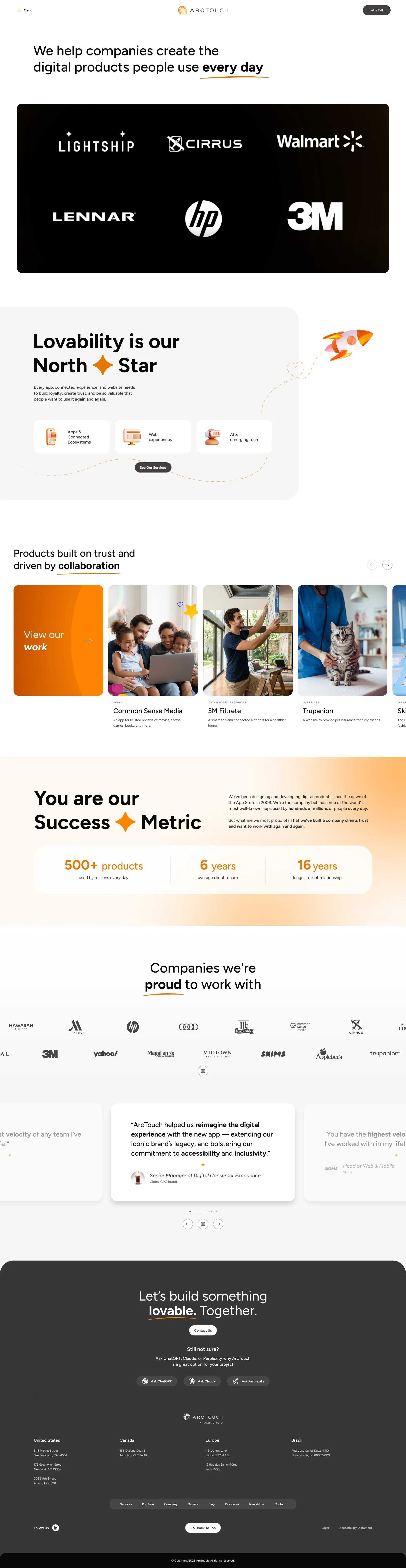
The ArcTouch website redesign, from benchmark to launch, validated with real clients.
- Client
- ArcTouch
- Role
- Lead product designer
- Timeline
- Dec 2025 – Sep 202610 months
- Tools
- Figma
- Maze
- v0
In 30 seconds
- The problem
- The ArcTouch website had to prove, in practice, what the agency sells.
- The delivery
- The full redesign, from benchmark to launch, across every format, theme and state.
- The outcome
- A final version shaped by tests with 4 real clients, live since September 2026.
- 4clients in moderated sessions
- 12+documented layout rounds
- 3devices
Context
ArcTouch builds digital products for major brands, guided by a simple idea: products people love to use, or "lovability".
To redesign its own website, full freedom was given over the workflow and deliverables, from benchmark to launch.
Challenge
The website itself had to prove what ArcTouch sells: make clear what the agency does, put the work on display and be a product people love to use in its own right.
Process
Discovery
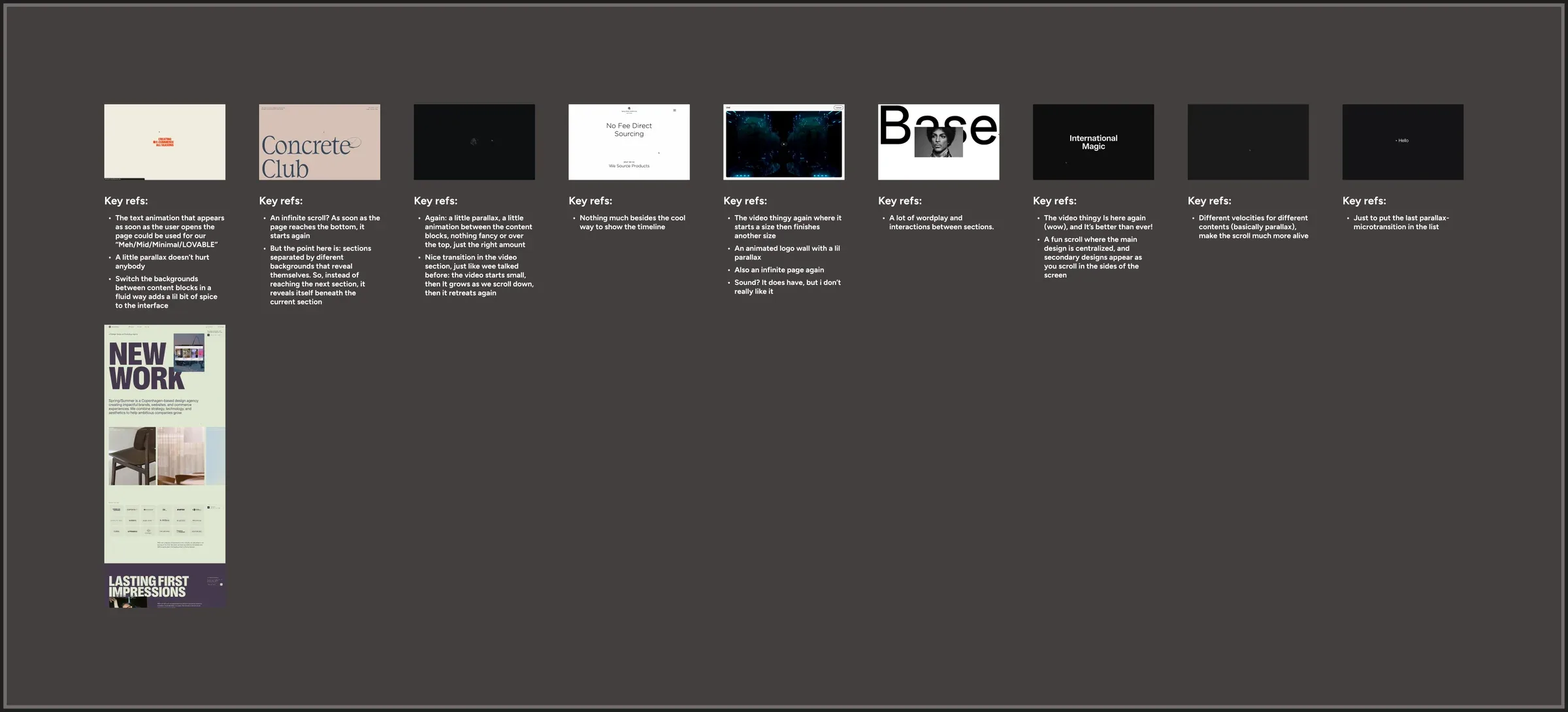
The starting point was benchmarking on four fronts: direct competitors, with a comparison table; interface patterns; transitions and animation, with notes on nine sites; and reference agencies.
- 01Direct competitors
- 02Interface
- 03Transitions and animation
- 04Agencies
Building in layers
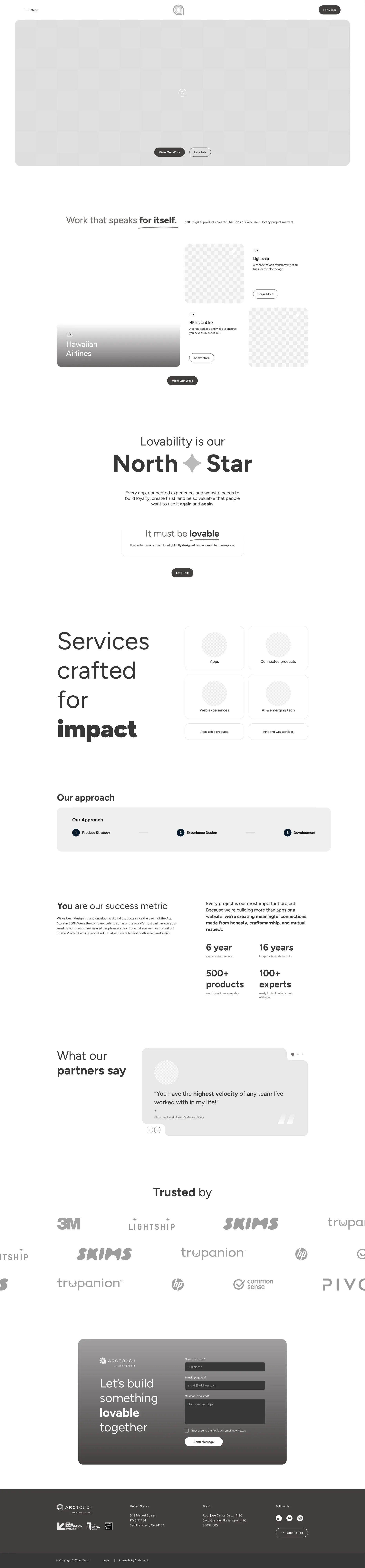
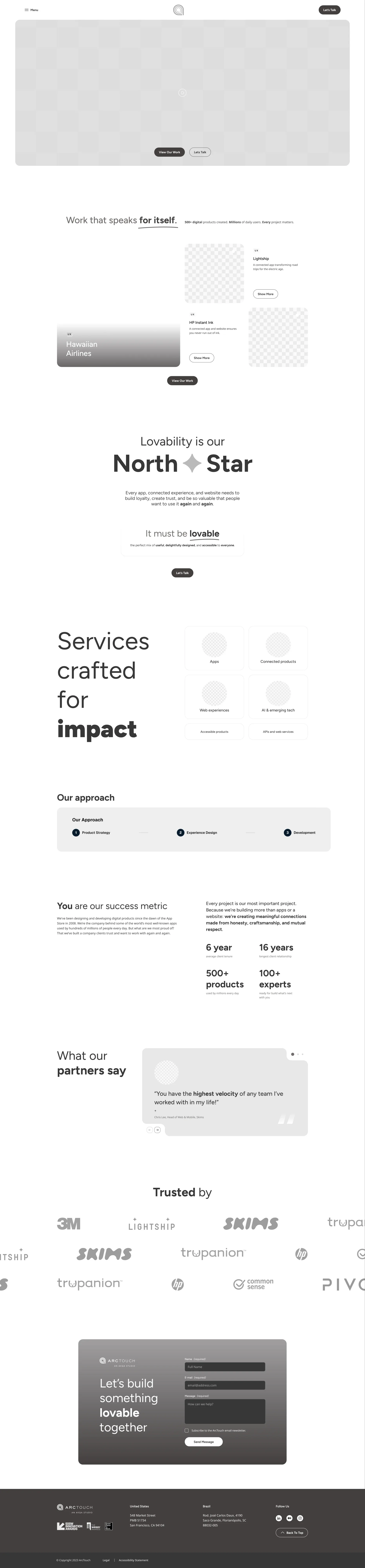
From low to high fidelity, each layer only moved forward once approved, across more than 12 documented layout rounds between December and March.
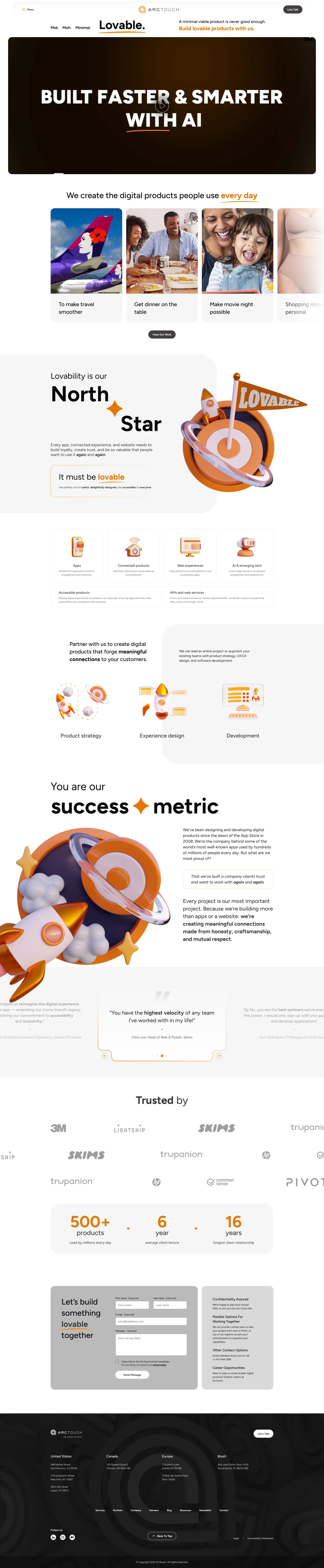
The first opening idea played with "minimum viable", striking words out until it reached "Lovable." It was dropped along the way, and the following rounds took the opening in another direction.
- 01Benchmarking4 reference fronts
- 02Low fidelitystructure and flow
- 03Mid fidelityhierarchy and content
- 04High fidelity12+ layout rounds
- 05Usability testing2 versions
- 06Rollout3 devices
- 07Deliverylive Sep 2026

Validation with clients
Before locking the direction, two versions of the site were placed side by side in moderated Maze sessions with 4 real ArcTouch clients, from companies such as Coca-Cola, Common Sense Media and Lonely Planet, across marketing, technology and product roles.
The feedback became a report for leadership with clear recommendations. The team followed them: content refinements and a new order for some sections, keeping the structure and visual direction.
4 moderated sessions · marketing, technology and product
Each dot is one of the 4 clients. The themes that came up most in the sessions:
What worked
- Clarity3 of 4
- Content3 of 4
- Interface2 of 4
- Portfolio2 of 4
What they asked to improve
- Header3 of 4
- Video3 of 4
- Brand logos2 of 4
- Contact2 of 4
- Mobile2 of 4
Solution
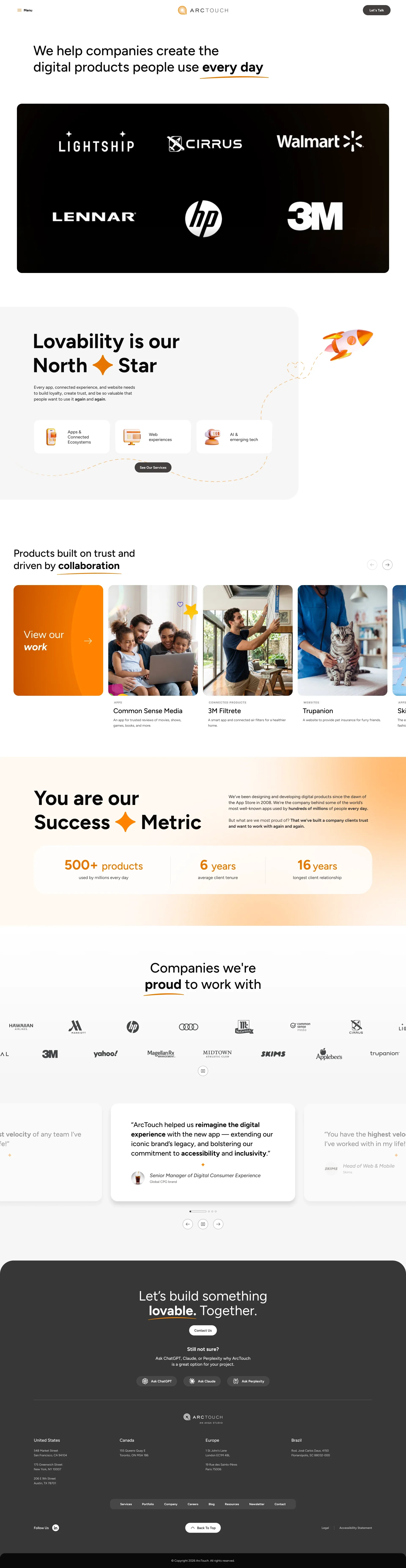
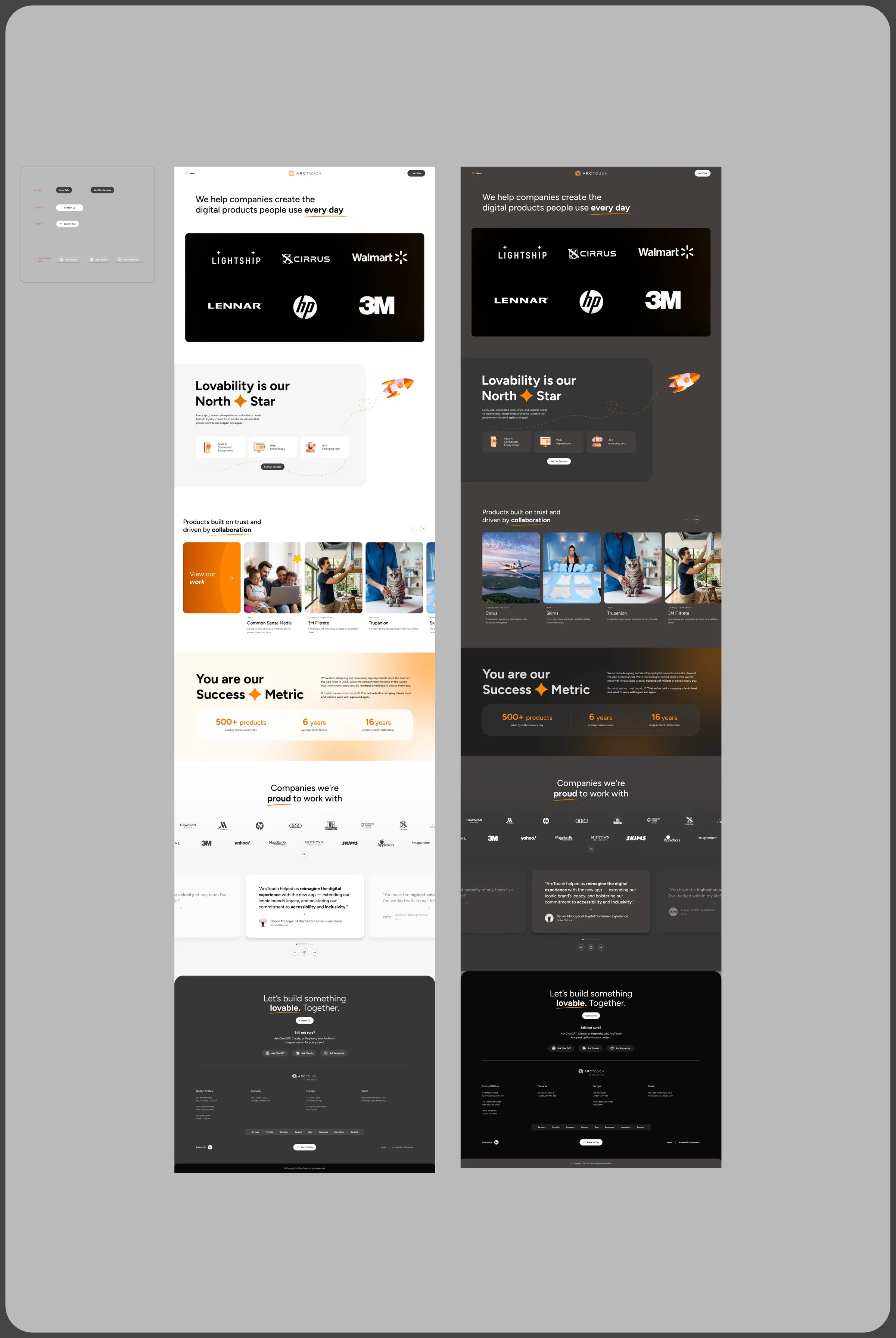
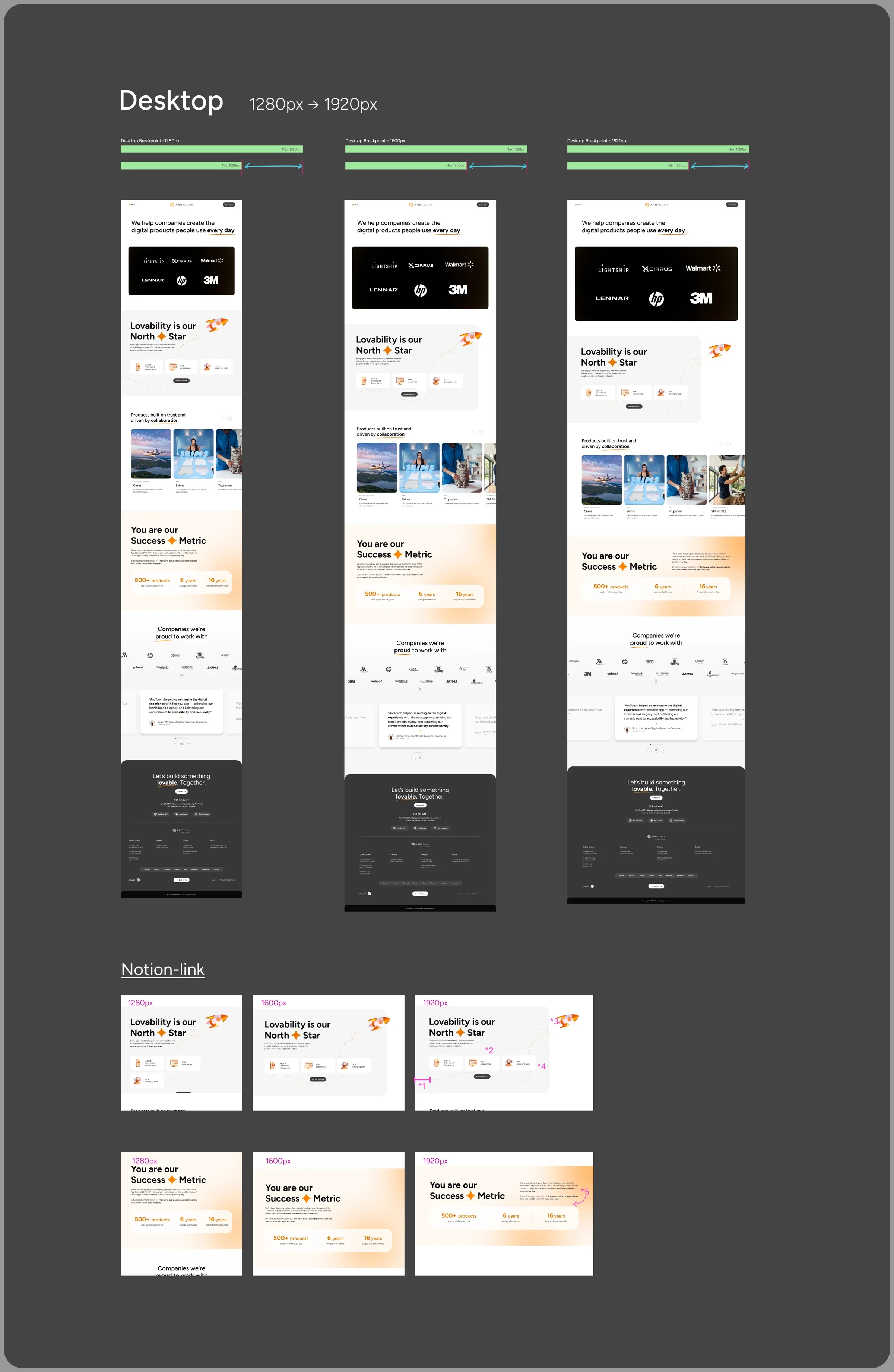
Rollout and delivery
- Desktop
- Tablet
- Mobile
- Light and dark
- Reduced motion
- Accessibility
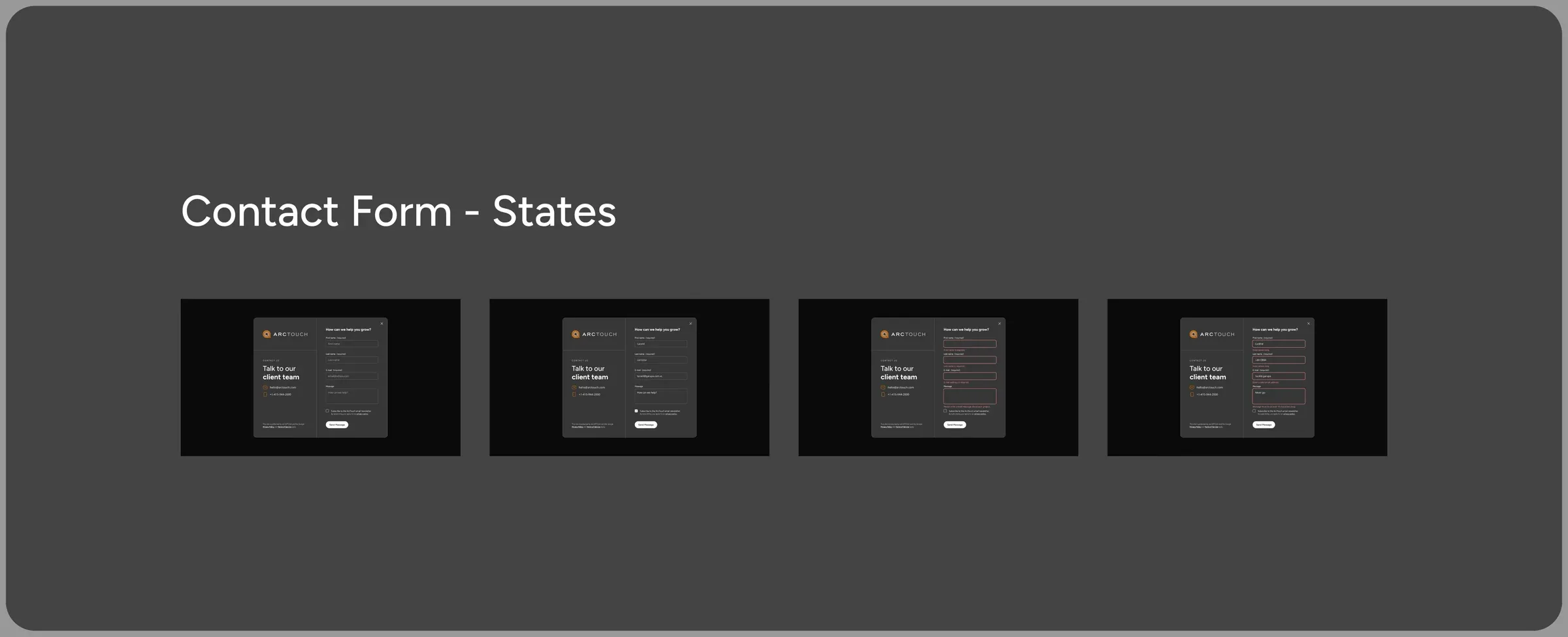
- Form states
- Breakpoint ranges


Outcome
Live since September 2026 at arctouch.com, the site does what the challenge asked for: it shows clearly what the agency does, puts the work front and center and was refined from what the clients themselves said.
A website about products people love to use, built with the same method ArcTouch applies for its clients.